Back from vacation I’m carrying a lot of new ideas with me. Some of these have already started before, some are new. This post is about how UI storytelling is employed in a project I’m participating: Ocularis.
Aesthetic Cohesion and Dissonance
A while ago I wrote a post about how video games present themselves via different channels to the player – there are different dimensions of perception that video games speak to – they are aesthetically complex. Quests, which are about the interplay of (non-)change and (non-goals), can make use of this broad bandwidth and thus strive for aesthetic cohesion on as many channels as possible in a given moment. This greatly heightens the effect that is meant to be achieved.
Now consider this post: https://forums.escapistmagazine.com/threads/essay-ludonarrative-dissonance-explained-and-expanded.110491/
Not ensuring the aforementioned cohesion can lead to a perceived disharmony, as shown in the famous debate in game studies around ludonarrative dissonance. I think though that deliberately employed dissonance can be used to diffuse a moment, causing lower tension and a change in pacing.
Storytelling in the UI of Ocularis
Oculars, a third-person action-adventure I’ve been working on with a team, tells a story not only via dialogue, character and environment, but also UI. We – consciously and unconsciously – inserted narrative information accompanying the more mechanical aspects. This adds a lot of cohesion, resulting in the player being more drawn into the world.
Here follow some examples:

The welcome message employs a color palette that is fitting to the atmosphere of the whole game. Besides the summary for the missing cinematic the Mundus Omnium is introduced as a world.

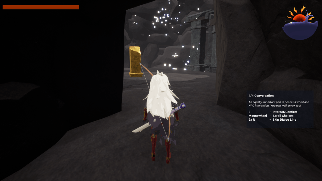
The tutorial pop-ups contain small atmospheric messages telling the player things about the avatar they’re going to play. Later messages contain less information, transitioning the player to be on their own.

Ocularis’ dialog system has two storytelling next to the obvious deploying of lines. The first is the color that is assigned to each speaker: The fairies have turquoise, symbolizing their magical nature and distance. Palli has a warm green: A very human and natural color. Leonora has white, for she lost herself. With time, a characteristic dark-red will return.
The second idea is that of small icons next to a decision line. This is borrowed from Cyberpunk 2077 and adds an extra, more direct impression of the choice.
Conclusion
Thinking about storytelling in this way is a great idea for indie developers like I am on Ocularis. Our team has not the capacities to do many gestures or even facial animations, so finding other channels to immerse and involve in a story/game is a good thing to achieve.
Though, of course, this approach helps bigger studios and games aswell.
Have a good time!
